When I was just starting out, these were the first watercolors I purchased that I got excited about. Jumping from Prang watercolors to WN Cotman was a big step up.
Before I get into the review I would like to tell you a little bit about the company. Winsor and Newton are based in the UK. The company was founded in the early 1800’s by chemist William Winsor, and artist Henry Newton. They worked together to produce reliable materials for artists.
Today they are one of the most well-known companies in the word. They produce a number of high-end products from watercolors, acrylics, oils, markers, inks, charcoals, brushes and more. They are known for consistently producing great products. One thing I will note about their watercolors-they come in pan and tube form. Winsor and Newton uses a different formula for their pans. Their pans are more concentrated and reactivate easier than their tubes dried in palettes. This holds true for both the professional grade watercolors, as well as the student grade.
For this review, I will be reviewing the Cotman watercolor tubes paints. They come in 8ml tubes ranging from $2.69-$4.49, and 21ml tubes ranging from $5.69-$9.49 depending on where you purchase them. I will be including a few links at the bottom where you can find these paints at a good price.
Now then, onto the paint!
Winsor and Newton cotman watercolors are made up of some of the same pigments they use for their professional line. They do not use artificial dyes in their paint. Because they use pigments instead of dyes for their student grade watercolors they will maintain some of the characteristics of their professional counterparts. So when using these paints you will still get a feel for the personality of the colors. You will see what colors are staining, and which are granulating. Which colors are transparent, and which tend to be more opaque and so on.
There is a bit of a learning curve for some when transitioning from student grade to artist grade paint, but with the cotman line I found transiting to be a breeze. When you get to know the characteristics of the colors you understand how to use them better.
Since this is a student grade watercolor manufacturers will use multiple cheaper pigments to mimic one expensive pigment to keep the product affordable. So most of these paints are mixes of 2 or 3 pigments. Mixed pigment paints can be annoying to mix colors with because of the risk of dulling and muddying the colors. [We will discuss the importance of single-pigment watercolor vs mixed pigment in a future post] These paints mix together okay. You are able to get the colors you need, but they definitely dull out. I’ll show some examples of mixes later in the post.
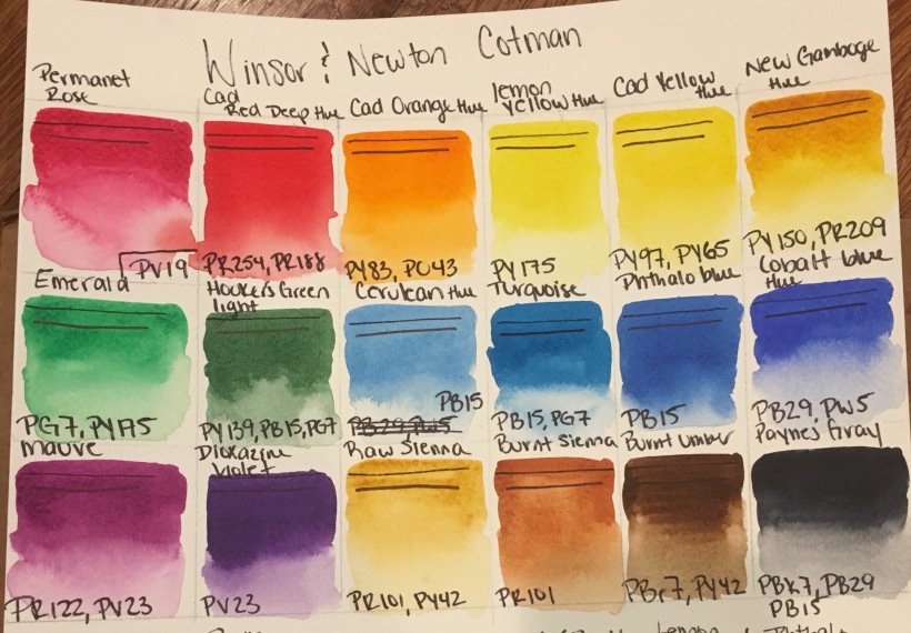
Below I have the paints swatched out. I included the name on top, followed by a black line to show transparency. The first line is under a layer of paint, and the line on the bottom is to compare. On the bottom of every swatch I listed out the pigment information.

I apologize if my handwriting is a little messy. The colors we have here are:
Permanent Rose (PV 19), Cadmium Red Deep (PR254, PR188), Cadmium Orange(PY83, PO43), Lemon Yellow Hue(PY175), Cadmium Yellow Hue(PY97,PY65), New Gamboge hue(PY150, PR209), Emerald(PG7, PY175), Hookers Green Light(PY139,PB15,PG7), Cerulean Hue(PB15), Turquoise(PB15,PG7), Phthalo Blue[intense blue](PB15), Cobalt Blue Hue(PB29,PW5), Mauve(PR122,PV23), Dioxazine Violet(PV23), Raw Sienna(PR101,PY42), Burnt Sienna(PR101),Burnt Umber(PBr7,PY42), and Paynes Gray(PBk7,PB29,PB15)
As you can see the colors are quite nice. They have a slightly chalky feel to them due to the fillers used. Every student grade paint contains less pigment and some filler. It’s another way the manufacturers keep the price lower. All the colors with the word “hue” mean that it is not the actual pigment, but a mix to replicate the pigment color. So the cadmium and cobalt in this line do not come from cadmium and cobalt pigments. Since the paints do not contain these elements they are safe around pets and children. Still be careful though. We wouldn’t our pets or children drinking or eating this stuff. While some are mixes to mimic the colors, others are the exact same as the professional line. Such as the Lemon yellow, New Gamboge, Permanent Rose, Dioxazine Violet, Phthalo Blue, Raw Sienna, Burnt Sienna, and Burnt Umber.
I also had an Ultramarine Blue, Alizarin Crimson, and a Sap Green. They are colors I use quite often so I used them up a while ago. Way before I decided to start this blog.
These paints disperse well in water. This is the first thing I look at when I’m trying out a new brand. I love the effects I get when I allow the pigments to just mingle and flow across wet paper. It’s one of my favorite characteristic of the medium. If they don’t move and flow where’s all the fun?
For student paints, they glaze very well. Because of the nature of student grade watercolors I am careful when I glaze with them. Use a light hand and a soft brush. If your brush is too stiff, or you are too rough on the paper you will risk disturbing, and possibly lifting the layers underneath. When glazing with these paints I make sure my first layers are dry.
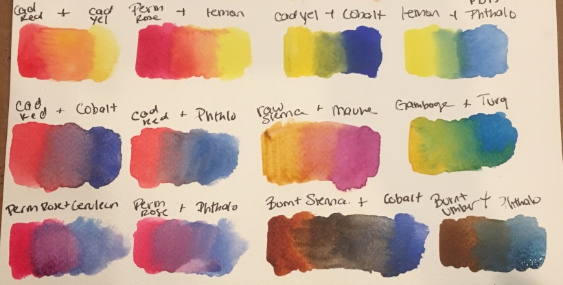
Below are some colors mixes. I used mainly primary colors to show basic mixing.

As you can see the mixes are not nearly as bright and vibrant as the paints by themselves. Some of these mixes create nice colors, they just aren’t nearly as strong or clear as I prefer. When painting with them I will let them mix together on the paper organically, rather than mix them together in my palette. This just keeps them a little clearer. This is where multiple pigment paint mixes and color theory can get a little complicated. To put it simply, the more pigments you mix together the more likely you will dull, and dirty the color.
A factor to keep in mind-I swatched and mixed these paints from my studio palette. I squeezed out the tubes and allowed them to dry for quite some time. If you are using paint straight from the tube the colors will have quite a bit more pop to them. As I mentioned earlier Winsor and Newton use different formulas for their pans and tube paints. These paints re-wet okay, but they do require a little more work to activate them. They dry pretty hard almost to a rubbery consistency, and they crack. I mist my palette with water to loosen them up a little 5-10 mins before I start painting. This makes re-activating them much easier.
Winsor and Newton’s website has lightfastness/permanence ratings of excellent(AA) or good(A) for pretty much all the colors in the line. There are a few that are rated “fair” due to the nature of the pigment used. I do not conduct my own lightfastness tests so I have no reason to challenge their ratings. The paintings I have done over a year ago are still in good condition with not much fading, but because they are student grade I just wouldn’t expect the to be as lightfast as professional grade watercolors.
Here are a few paintings I have done with these paints:


So all in all these paints have treated me very well. They are a wonderful student paint for anyone starting out, or for anyone that doesn’t want to spend the money on professional grade watercolors. I love them and have really enjoyed using them.
Here are some places you can find them online:
Hope you guys enjoy this review. If anyone has anything to add please comment below! Happy Painting!